Branding Portfolio Identity by Colart Digital Marketing Agency

Brand Identity · A HEDMEN Company Initiative

Hand In
Hand

أيد بأيد

A community-support initiative descended from the HEDMEN family of companies, carrying the same foundation of trust and care into direct, hands-on support for people and neighborhoods.

Compassion Community Trust Hope
Hand In Hand logo
1.0 Foundation

Descended from HEDMEN

Hand In Hand carries the HEDMEN family's commitment to excellence, trust, and care beyond the clinic, into neighborhoods, families, and the everyday moments where a helping hand matters most. It is the human, community-facing side of a group built on precision and reliability.

Vision

A community where support is never out of reach, where compassion moves as naturally and readily as one hand reaching for another.

Mission

To stand beside people and communities with practical, hands-on support, extending the trust and care built by HEDMEN into direct, everyday impact.
2.0 What We Stand For

Our Values

The principles that guide every hand extended, every partnership formed, and every community reached.

Compassion

Every interaction is rooted in genuine care for people's wellbeing.

Community

We show up where people already are, in neighborhoods, not just offices.

Trust

Inherited from HEDMEN: reliability and integrity in every commitment.

Hope

We focus on what's possible, building toward better outcomes together.

Unity

Support works best joined, hand in hand, not hand alone.

3.0 The Mark

An H, held together

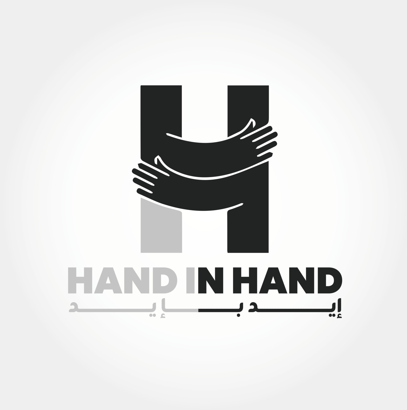
The logotype's H is formed from two hands in an embrace, a direct, literal expression of the name and mission. It echoes HEDMEN's own icon, where the H is built from a stethoscope, keeping a clear visual thread between the two identities.

Hand In Hand primary logo lockup
1

The Icon

Two hands embrace to form the letter H, unity and support made literal in the mark.

2

The Wordmark

Bold, geometric letterforms in Charcoal Gray and Soft Gray, mirroring HEDMEN's own primary palette.

3

The Arabic Mark

أيد بأيد sits beneath the logotype, carrying the name into the communities Hand In Hand serves.

4.0 Color Palette

Carried from the HEDMEN family

Hand In Hand keeps the HEDMEN group's core palette to stay visually unified across every entity, with Muted Olive stepped forward as its own signature: a color of growth, hope, and quiet warmth.

Primary

Charcoal Gray
#232323
Soft Gray
#C4C4C4
Black
#000000
White
#FFFFFF

Signature Accent

Muted Olive
#6B7C6F
Warm Sand
#F5F3EF
Light Gray
#EDEDED
5.0 Typography

Poppins & Inter

The same typographic system as HEDMEN: Poppins for display and headings, Inter for body copy, keeping every touchpoint in the family instantly recognizable.

Primary: Display & Headings
Poppins, Bold / Extrabold
Aa Bb Cc
ABCDEFGHIJKLMNOPQRSTUVWXYZ
0123456789
Secondary: Body Text
Inter, Regular / Medium
Aa Bb Cc
abcdefghijklmnopqrstuvwxyz
0123456789
Hand In Hand mark

Hand In Hand, HEDMEN Company

Part of the HEDMEN family, extending trust, care, and community support to the people who need it most.

Back to Top
Hand In Hand mark

Thank You

Brand Identity Presentation · A HEDMEN Company Initiative

Identity Design & Guidelines By

Colart Digital Marketing Agency